


Are you planning an end of year campaign for your users? A yearly recap of what they and you accomplished together can help you make it more personal. You can read about how to plan a great Year in Review campaign in our guide!
In this article, I'm going to show you how to auto-generate personalized, shareable infographics for your users with the nocode tool Make and our creative automation toolkit Placid. You'll need accounts for both services. The free plan for Make will work, and there's a free trial for Placid as well.
What we're going to build
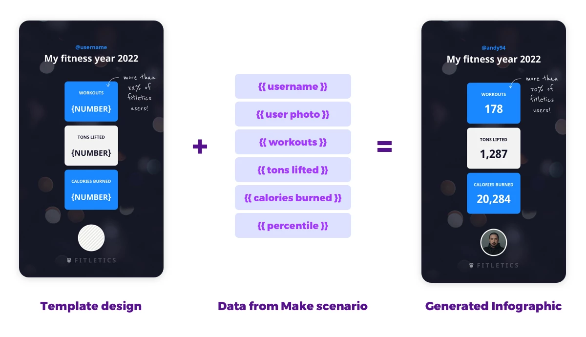
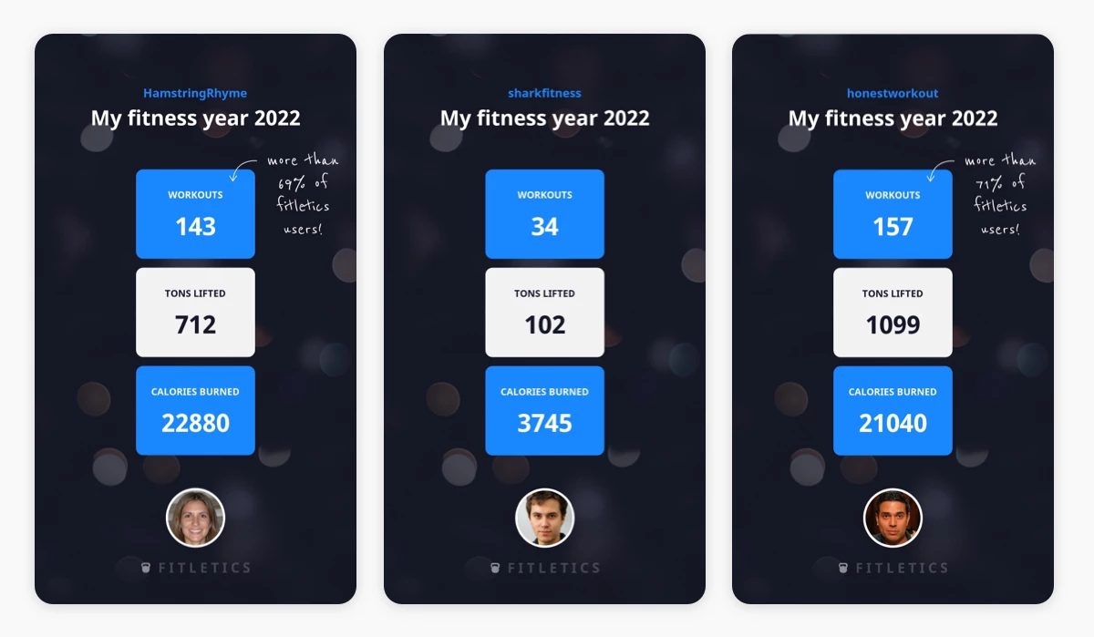
We're creating an infographic for the users of a fictional Fitness app. It will include their yearly statistics and their profile info.
We're also going to add a custom note if they completed more workouts than a certain amount of other users. This adds an element of social comparison that we want to use to make them feel good. We're not going to point it out if someone did not so well, obviously.
Video Tutorial
Prepare the data for your campaign
The most important step in this workflow is the preparation of the content of your infographics. We will need structured data about your user's accomplishments to generate our images.
Think about what statistics you could use that really shows your app's impact on your customer's lives. In our case, it's their fitness accomplishments (number of workouts, tons lifted and calories burned) that they logged with our app.
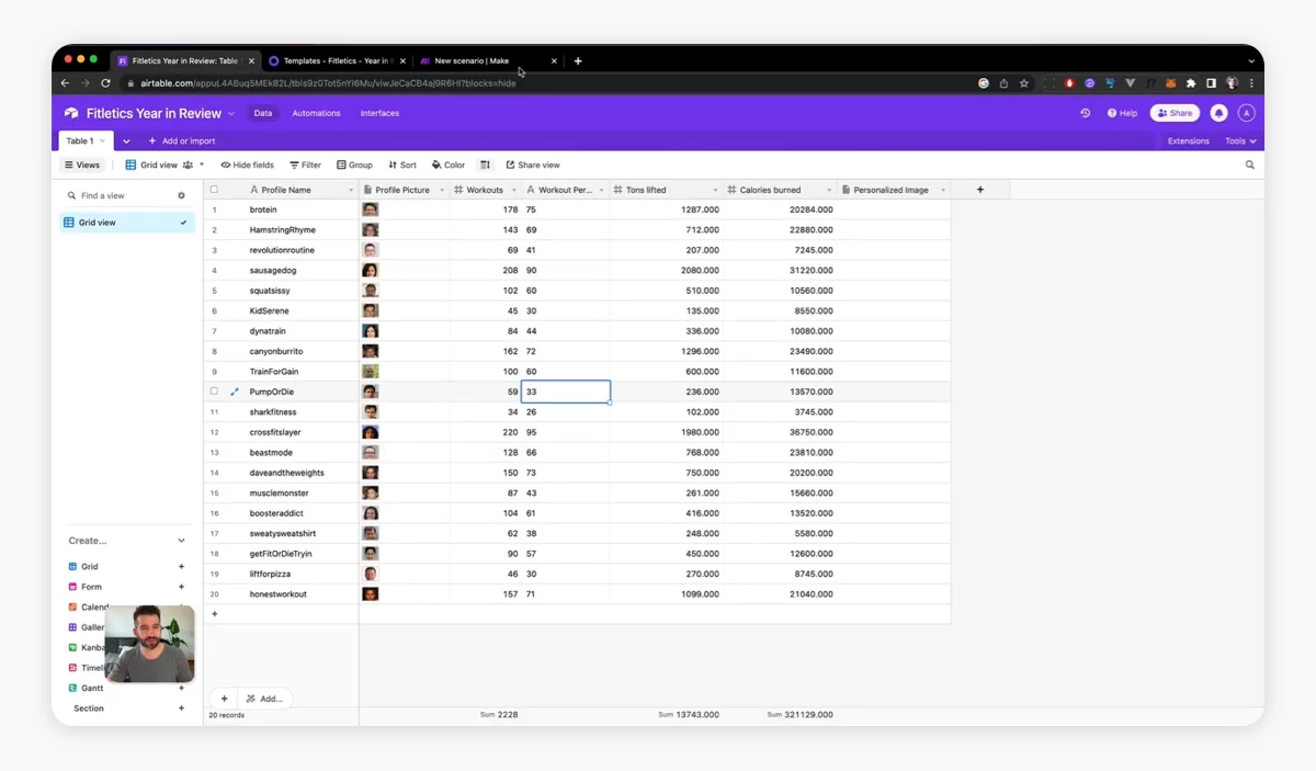
So we prepared a spreadsheet with these columns / fields:
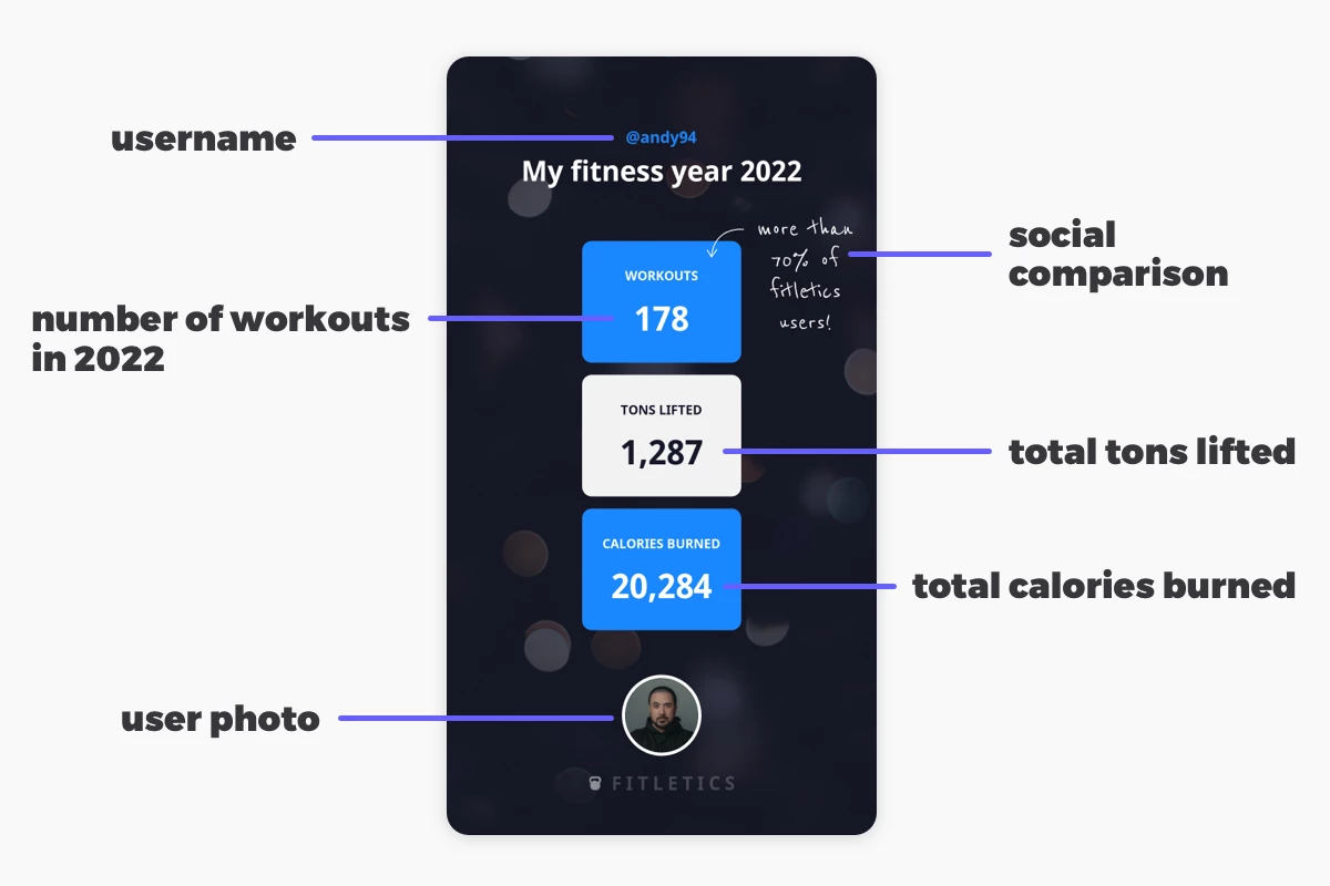
Profile Name– usernameProfile Picture– (link to the) user's photoWorkouts- number of workoutsWorkout Percentile– the calculated % of users that completed fewer workoutsTons lifted- total number of tons lifted during workoutsCalories burned- total number of calories burned during workouts
For this tutorial, we used an Airtable with 20 example rows. This could be any other database or e.g. a Google Sheet. You might need a developer to get this data out of your app's database first, but if you show them the structure you need this should not be a roadblock.
Later, we're going to take this data for every user and automatically fill it into different layers of a template to generate infographics.
Set up a Placid project with a Make integration
Before we start working on our Make scenario, we need to create a Placid project with a Make integration. In Placid, click Projects > Add new project, or add the integration in the settings of an existing project.
Create a template for your personalized visuals
Now we need a design for our infographic. A Placid template has dynamic layers that can be filled with our data to auto-generate variations. To create your own go to Projects > Templates > Create Template. You can start from one of our presets or with a blank canvas. I chose the Story format (1080x1920) as it's super shareable.
You can then design your template with our drag & drop editor, creating layers for all of the data you have gathered.
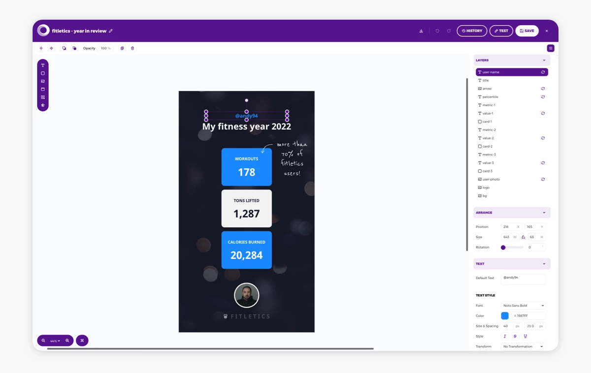
Make sure that all of the layers that will hold data from our spreadsheet / database show the 🔄 dynamic icon in the layer list.
Save your template as soon as you're happy with it and close the editor.
Start a Make scenario with your data module
Now go to Make and create a new scenario. Click the plus icon and choose the app that holds your data. In my case it was Airtable (with a Search Records action), but for you it might be Google Sheets or something else. Connect your account and specify your spreadsheet.
For Airtable, I needed to choose my Base and Table. During the setup of my scenario, I set the limit (maximum amount of records to return) to 1, so it runs only through one record instead of all rows. This makes testing faster.
 set a limit for processed records")
Add a Placid module to your scenario to generate visuals
Then, add a Placid module. Create the connection by entering your Placid project's API token. You can find it in the API Tokens menu or when clicking the Integrate button of your template.
Choose your template. Then you will see all of the dynamic layers in it and input fields for different values we can customize (like text input for text layers). We're now going to fill these values with the data from our database (Airtable).
Connect your data to your layers
When clicking into the input fields, Make will suggest the fields from your Airtable module. Fill in the correct variables, e.g. the Profile Name variable / field is defined as the text of the User-name layer.

For image layers, use the URL of the image in your Airtable (open the variable menu 🔽 and choose URL).
Configure conditional layers
We want to only show the note about the percentile ("better than x% of users) on our infographic if the user did better than a certain amount of other users. We wouldn't want to tell them if they're in the lowest 5%, as that's kind of demotivating.
First, we're going to specify the text for the Percentile layer using the variable Workout Percentile: "more than Workout Percentile% of fitletics users"
Then we will add a condition to the Hide Layer toggle of the layer: if(WorkoutPercentile<40;true;false). This will hide the layer if our calculated percentile is below 40%. This means we will show the note as soon as a user has completed more workouts than 40% of users.

We also need to add the same Hide Layer condition to our Arrow layer, as it's a connected design element that should not be displayed either.
Complete the scenario
Now it's your turn to decide what you want to do with your generated images.
In my case, I wrote them back into the empty field Personalized Image of the type attachment in my Airtable.
Add another Airtable module with an Update a Record action. Choose your Base and Table again. Specify the Record ID as the record ID variable from your first step so the workflow will put the image into the same row as the data.
In the Personalized Image field of the record, put the Placid Image URL variable into the File URL field.

Test your workflow
Run your scenario once to test your configurations. You should see one generated image with the data of one of your records appear in your Airtable.
If you're happy with it, you can remove the limit in your first Airtable module to generate images for all of your data. Then check if your conditional layer is being displayed correctly for all users.
What's next?
In this tutorial, we generated personalized images from our data and sent the images back to our Airtable / database.
Depending on your campaign and toolkit you could also use Make to send the personalized images via email, post them on social media or save them somewhere else (e.g. your Google Drive). Make offers a lot of flexibility - the hard part is deciding what to do with it 😉
Think about how you could provide your Year in Review infographic in a way that your users can share it. Make it easy for them to show off their annual (fitness) accomplishments to their friends and families!
If you want to talk about your ideas or need support,