


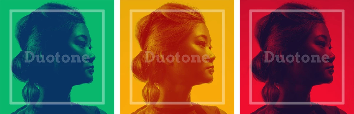
Duotone is a great effect to create designs that stand out.
Did you know that it was originally a technique to save money on color for printing photographs? Duotone means something like "double color", describing the effect of using only two contrasting colors to print a photo. The light tones of the photo are replaced with one color, and the dark tones with another.
Why Duotone effects work well for marketing assets
Duotone is a pretty clever effect to create a consistent style and mood when using different photographs. It can be used to create strong signature styles, like Spotify proved with their wildly popular ads and visuals a few years ago.
In social feeds and online marketing, duotone effects help make your posts stand out: Strong colors for attention plus high branding effect!
Additionally, they work great if you want to overlay them with a logo or text. So it's definitely a great effect to use in templates for creative automations (which is what we do!).
Creating social media graphics using Duotone effects with Placid
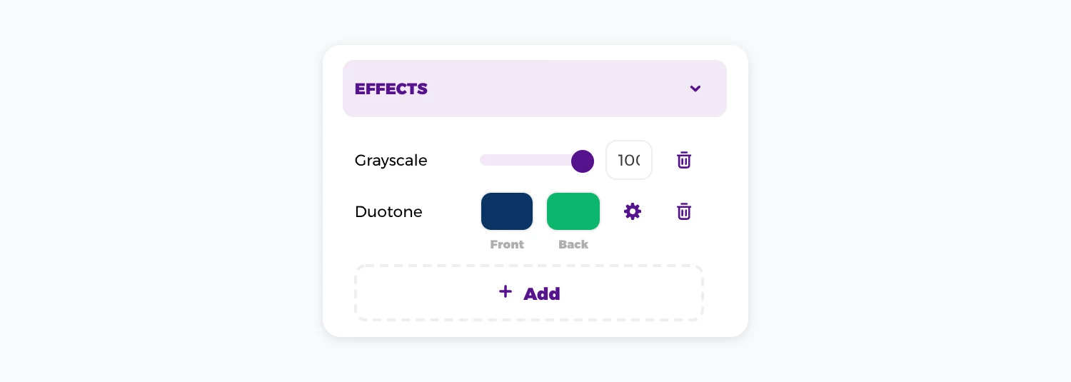
If you create templates for your social media images with Placid, you can add custom duotone effects to your picture layers. Select the image you want to use it on and use the settings in the effects panel:
- For best results, convert the image to grayscale or sepia first. Add a grayscale effect in the effects panel and set it to 100%.
- Then add your duotone effect. Our editor offers some preset combinations for you if you don't have an idea of color combinations you want to use (click the ⚙️).
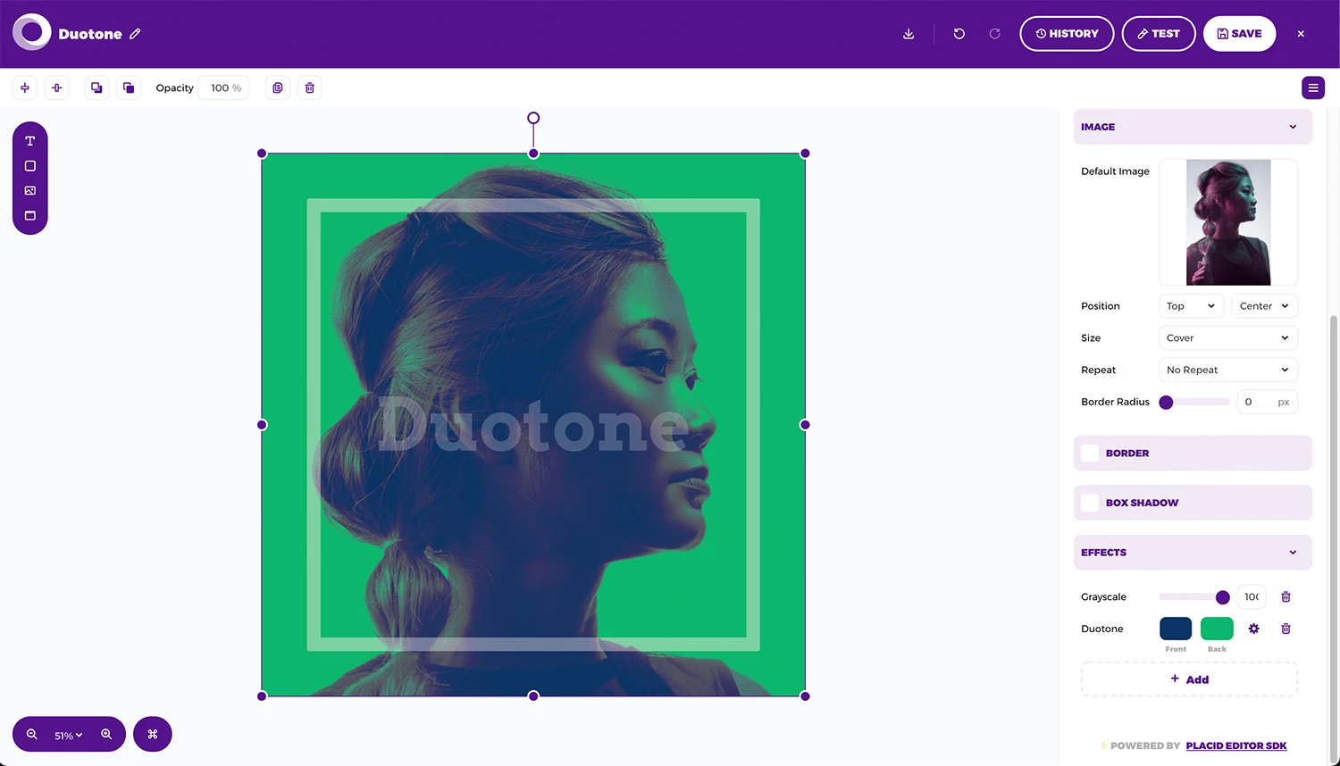
Play around with different tints to get the look you want!
Just like in print, the duotone effect for digital assets works by blending your two color tones with the shadows and highlights of the photo: Use a darker shade for the front color (blended with the shadows), and a lighter shade for the back color (blended with the lights).
Check out some of the inspirations below if you need ideas! 👀
Tips and tricks for duotone effects in branded layouts
- Convert your photos to grayscale or sepia first. This ensures that the duotone colors blend with monochrome shades only, and will come out vibrant and clear.
- Blend two shades of the same colors for a relaxing tone-in-tone effect. This works especially well if you use it for background photographs, and also enhances the readability of any text you want to overlay.
- Choose bright accent colors and complementary shades if you want to create bold designs that stand out.
- Use your brand color in your duotone color combinations to make your graphics recognizable as yours.
- Photos with high contrast work best for bright color combinations. The cleaner the background, the more people and objects will stand out using a duotone effect.
Example duotone layouts for social media graphics
We prepared some example layouts and color combinations for you that you can reuse if you like!
A calm tone-and-tone design for a music service
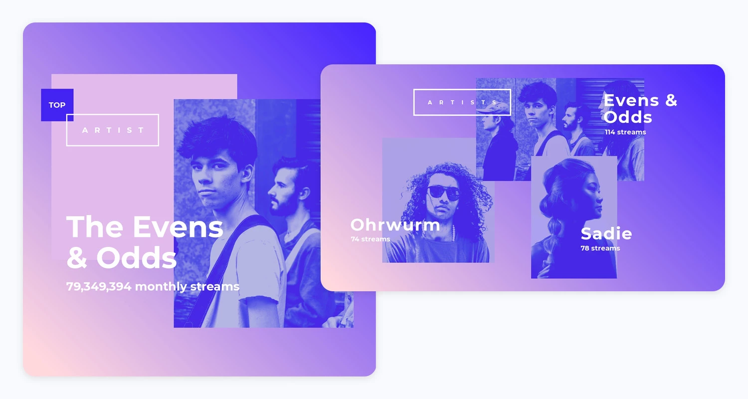
This layout inspired by one of the "Year in Music" campaigns by Spotify uses calm tones and gradients, as well as a tone-in-tone duotone effect using a dark (#4728E4) and light (#B5B5FF) shade of blue.
A bold layout for a tech event's social content
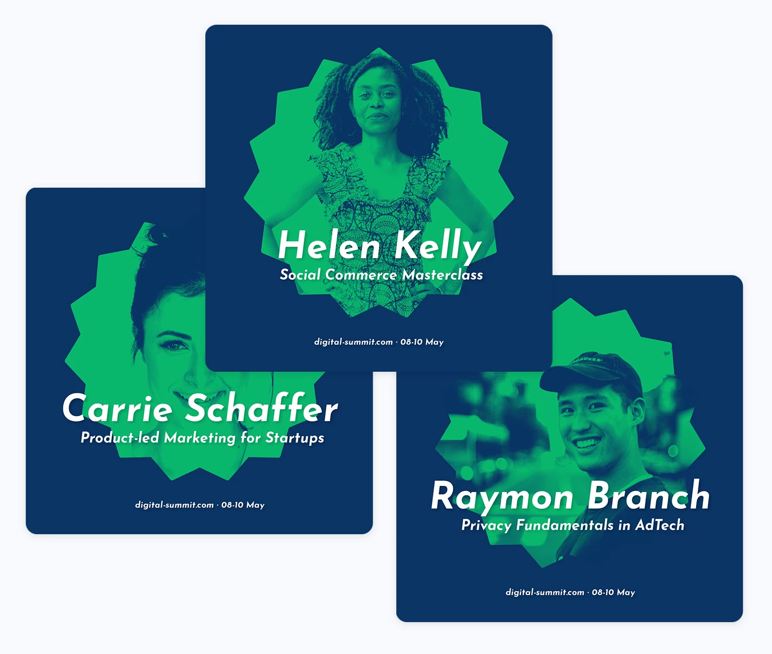
This layout for speaker announcements of a conference shows off the brand impact of a duotone effect: No matter how different the speaker portraits are – the finished graphic always has the same look & feel. The duotone effect is made with techy dark blue (#0A3463) and green (#08B76C) shades. (This is also available as a preset color combination in our editor!)
A fun and eye-catching design for podcast marketing assets
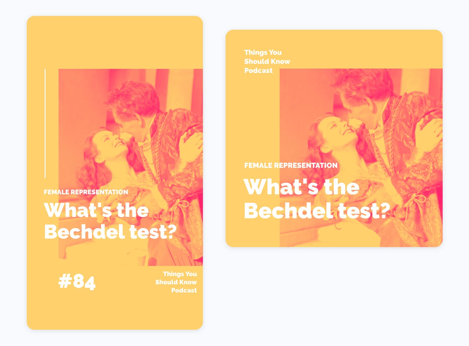
This layout for podcast marketing assets uses a bold pink (#FF1F8A) and yellow (#FFD06C) color combination. It's a fun design, especially because of the contrast of the traditional photograph and the more brutalist color scheme of the duotone effect.
Duotone image automations
Your duotone templates can now be used for creative automations: Use the Placid to automatically generate hundreds of unique duotone assets. Fill your templates with different photographs and texts to create as many versions as you need!
We offer REST and URL APIs as well as nocode integrations for Zapier, WordPress, Airtable and more.
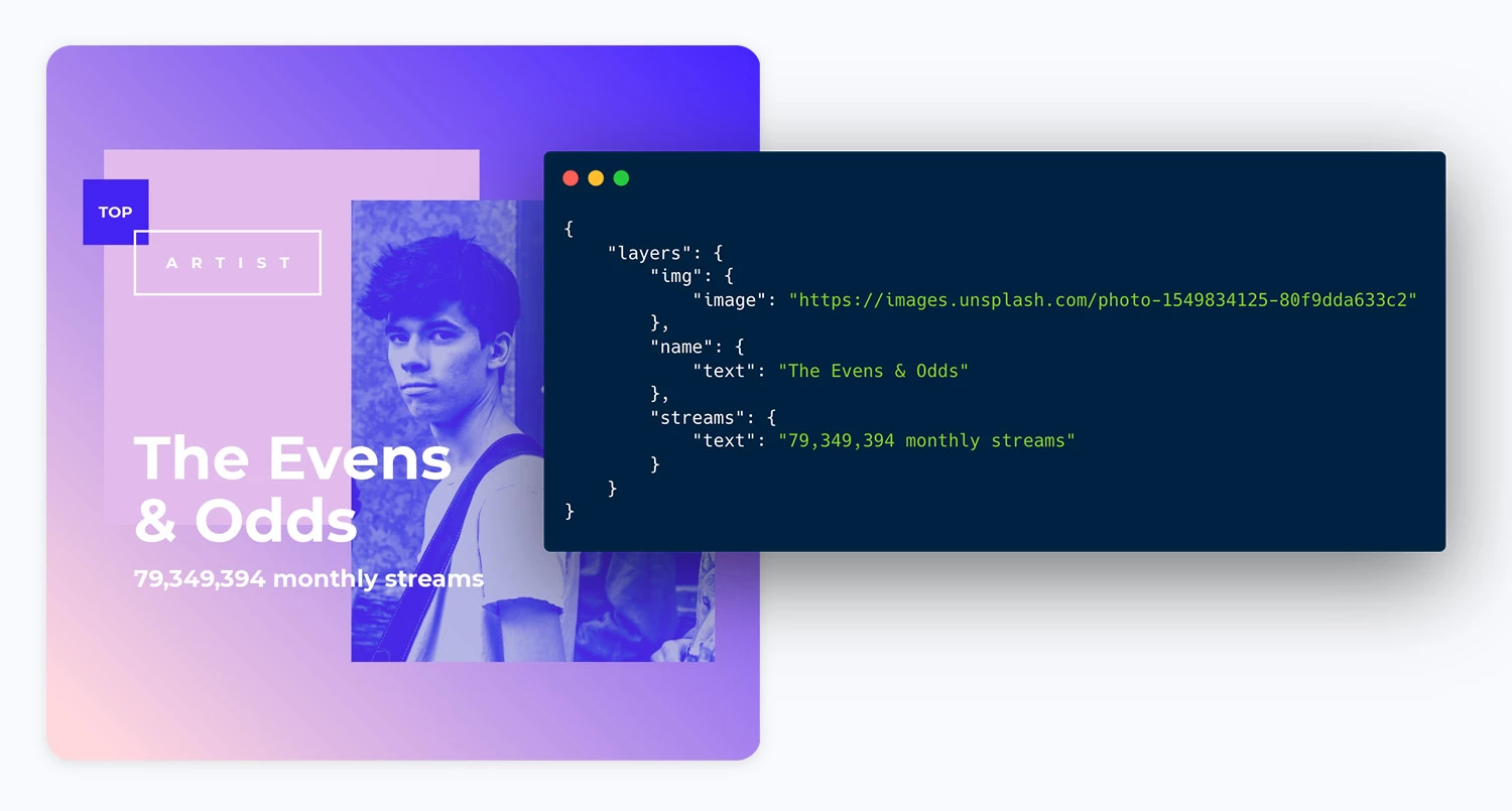
https://api.placid.app/u/jvvyijdws?&img[image]=https%3A%2F%2Fimages.unsplash.com%2Fphoto-1549834125-80f9dda633c2&name[text]=The+Evens+%26+Odds&streams[text]=79%2C349%2C394+monthly+streams